Tips for view modes
When you embed content within a blog post, you typically need to fit it within a specific screen size. You can adjust the height and the width in the iFrame tag as needed. However, you need to ensure your report fits within the given iFrame area, so set an appropriate View Mode when you're editing the report.
The following table provides guidance about the View Mode, and how it will appear when embedded.
To fit your embedded content within a specific screen size, adjust the height and width in the iFrame tag. Make sure to set an appropriate View Mode when editing the report.
| View Mode | How it looks when embedded |
|---|---|
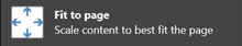 |
Fit to page respects your report's page height and width. If you set your page to dynamic ratios like 16:9 or 4:3, your content scales to fit within the iFrame. When embedded in an iFrame, using Fit to page can result in letterboxing: a gray background is shown in iFrame areas after the content scales to fit within the iFrame. To minimize letterboxing, set the height and width of the iFrame appropriately. |
 |
Actual size ensures the report preserves its size as set on the report page. This can result in scrollbars appearing in your iFrame. Set the iFrame height and width to avoid scrollbars. |
 |
Fit to width ensures the content fills the horizontal area of the iFrame. A border is still shown, but the content scales to use all the horizontal space available. |
A Publish to web embed code looks like the following example:
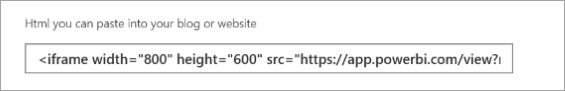
You can edit the width and height manually to ensure it's precisely how you want it to fit in the page where you're embedding it.
To achieve a more perfect fit, you can try adding 56 pixels to the height of the iFrame to accommodate the current size of the bottom bar. If your report page uses the dynamic size, the table below provides some sizes you can use to achieve a fit without letterboxing.
| Ratio | Size | Dimension (width x height) |
|---|---|---|
| 16:9 | Small | 640 x 416 px |
| 16:9 | Medium | 800 x 506 px |
| 16:9 | Large | 960 x 596 px |
| 4:3 | Small | 640 x 536 px |
| 4:3 | Medium | 800 x 656 px |
| 4:3 | Large | 960 x 776 px |